VICTORIA & ALBERT MUSEUM AT DUNDEE
Dundee, Scotland
CLIENT V&A at Dundee
PROGRAM National Design Centre located in the River Tay, including V&A galleries, design incubator, event space, restaurant, cafe, wine bar, art handling and storage facilities, offices, and retail
AREA 6,700 m² (72,100 sf)
COST US$52 million
STATUS Limited competition, second prize 2010
DESIGN ARCHITECT REX
PERSONNEL Haviland Argo, Keith Burns, Roberto Otero, Joshua Ramus, Jacob Reidel
EXECUTIVE ARCHITECT RMJM
CONSULTANTS Arch Henderson, Buro Happold, Donnell Consultants, DHV, Hargreaves Associates, Magnusson Klemencic, Tillotson, Transsolar, Turner & Townsend, 2×4
In the economic age of “new sobriety,” architecture can be freed from the struggle between form and function by emphasizing performance instead—a hybrid that doesn’t discriminate between program, organization, and form. The measure of performance is relative to each project’s constraints and aspirations. The V&A at Dundee’s vision exacts sophisticated demands: it must serve as a key driver in Dundee’s new Central Waterfront Masterplan, inhabit a challenging site, embody best sustainable practices, adhere strictly to budget, and most importantly, exhibit and incubate design. By eschewing convention and doggedly searching for responses specific to these particular demands, an unexpected and iconographic building will emerge that is the embodiment of performance, not a symbol of excess
Create a “Layer Cake”
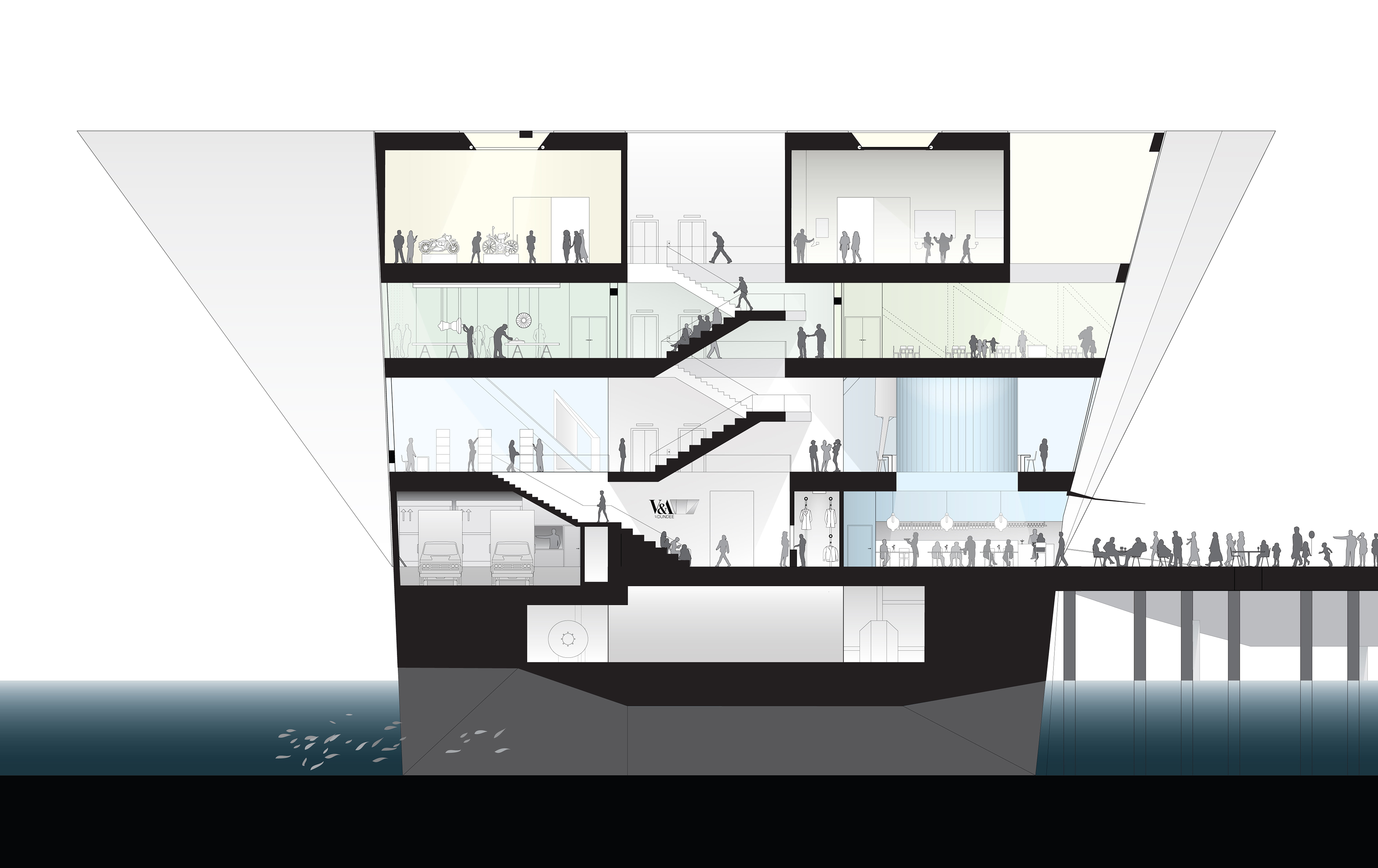
Sorting the V&A at Dundee’s program into clusters of similar uses creates a four-level Layer Cake with each layer dedicated to, and equipped for, specific duties. These layers include the V&A’s exhibition space, an incubator for Scottish design, an interior urban realm for the City of Dundee, and a ground-level marshaling area. Finishes, height, structure, circulation, and degree of flexibility vary, allowing each layer to be used and changed without detriment to the others.
Seemingly, the most compact and simple volume for the Layer Cake—a cube—would be the most energy- and cost-efficient organization. However, a cube cannot accommodate all the V&A at Dundee’s galleries on a single floor, does not respect the high cost of building in the River Tay, and does not optimize building geometry for sustainability.
Stretch the Top
Stretching the cube’s top to fit all galleries within the Exhibition Layer maximizes exhibition flexibility and continuity of patron experience. Further, skylights provide natural light to every gallery, reducing the V&A at Dundee’s highest energy demand: gallery lighting.
Contract the Base
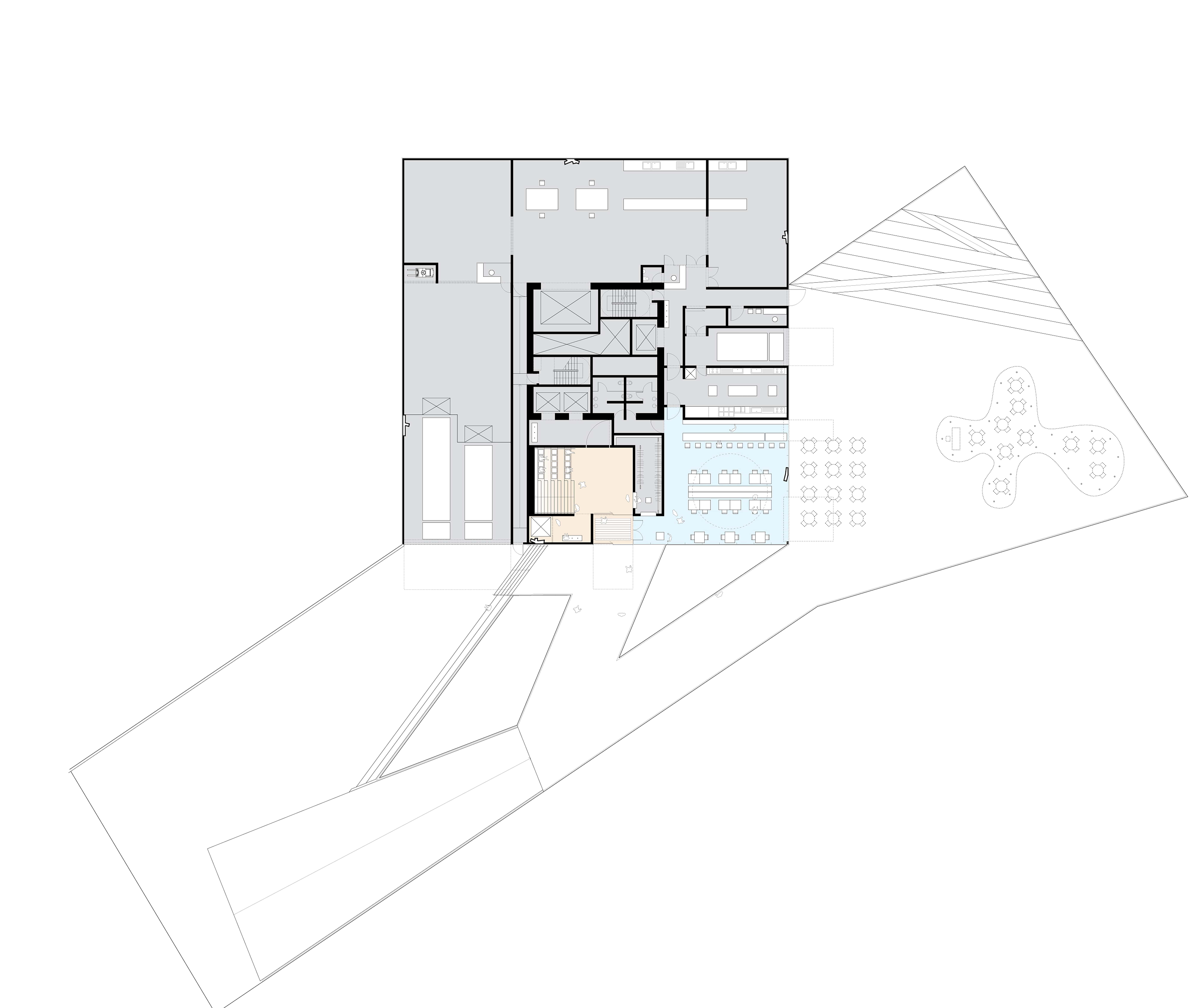
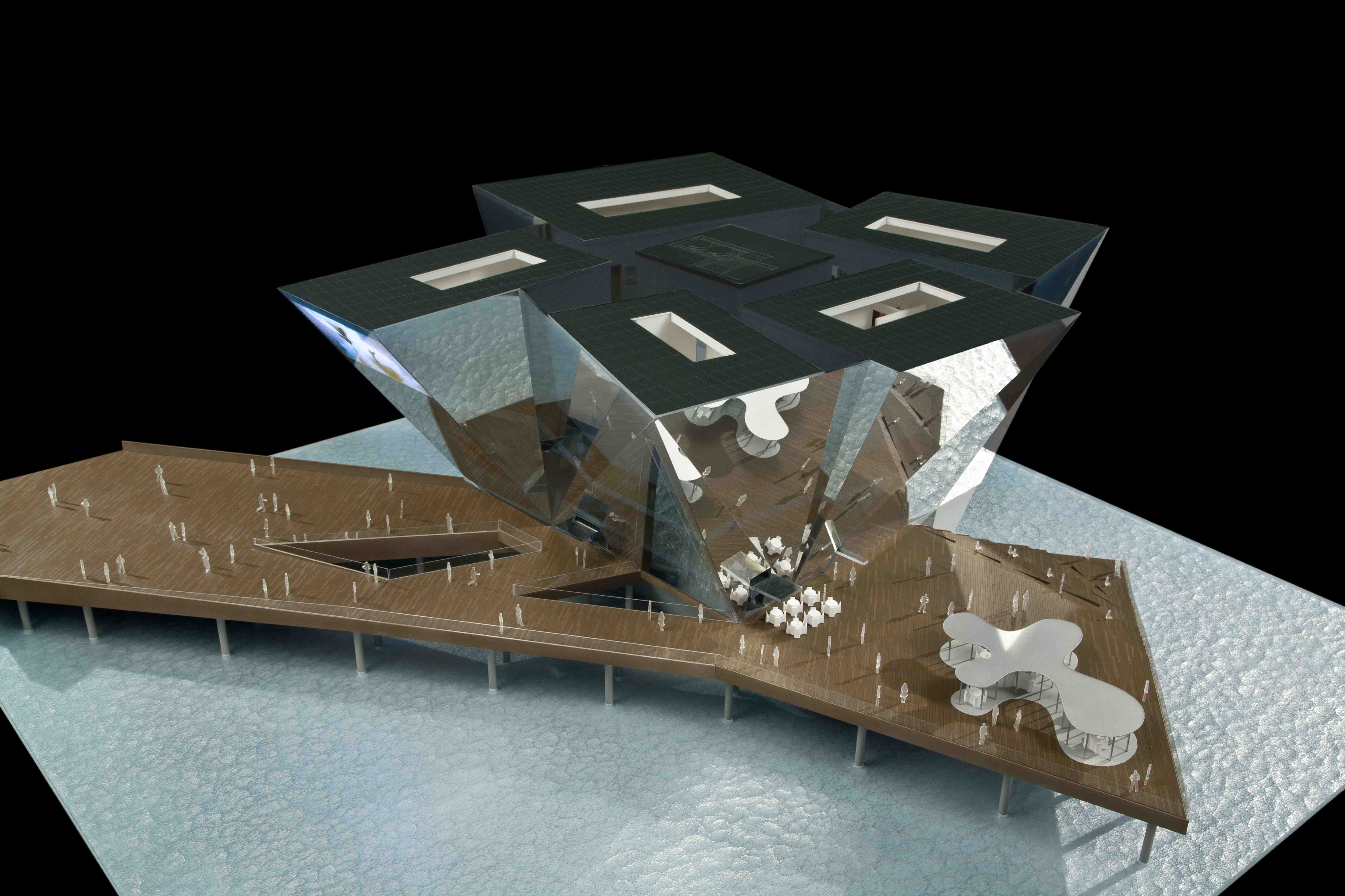
By contracting the Marshalling Layer to contain only those elements required at grade—loading docks, secure storage areas, public and staff entries, Signature Restaurant, and Wine Bar—the smallest building footprint is achieved. Having minimized the building’s sub-structure, and hence its cost, the maximum amount of the Site Creation budget can be spent generating credible public space in the form of an exterior plaza extending Union Street’s axis far into the River Tay, giving Dundee’s citizens and visitor’s uninterrupted views.
Maximize Sustainability
The resulting shape is a combination of maximized horizontal surface area for solar and rainwater collection, optimized sun response, and as mentioned previously, maximized daylight penetration into the galleries. In summer, the tapered shape is self-shading yet provides reflected light deep into the building. In winter, low sun angles allow sunlight to penetrate directly into the V&A at Dundee.
Centralize the Core
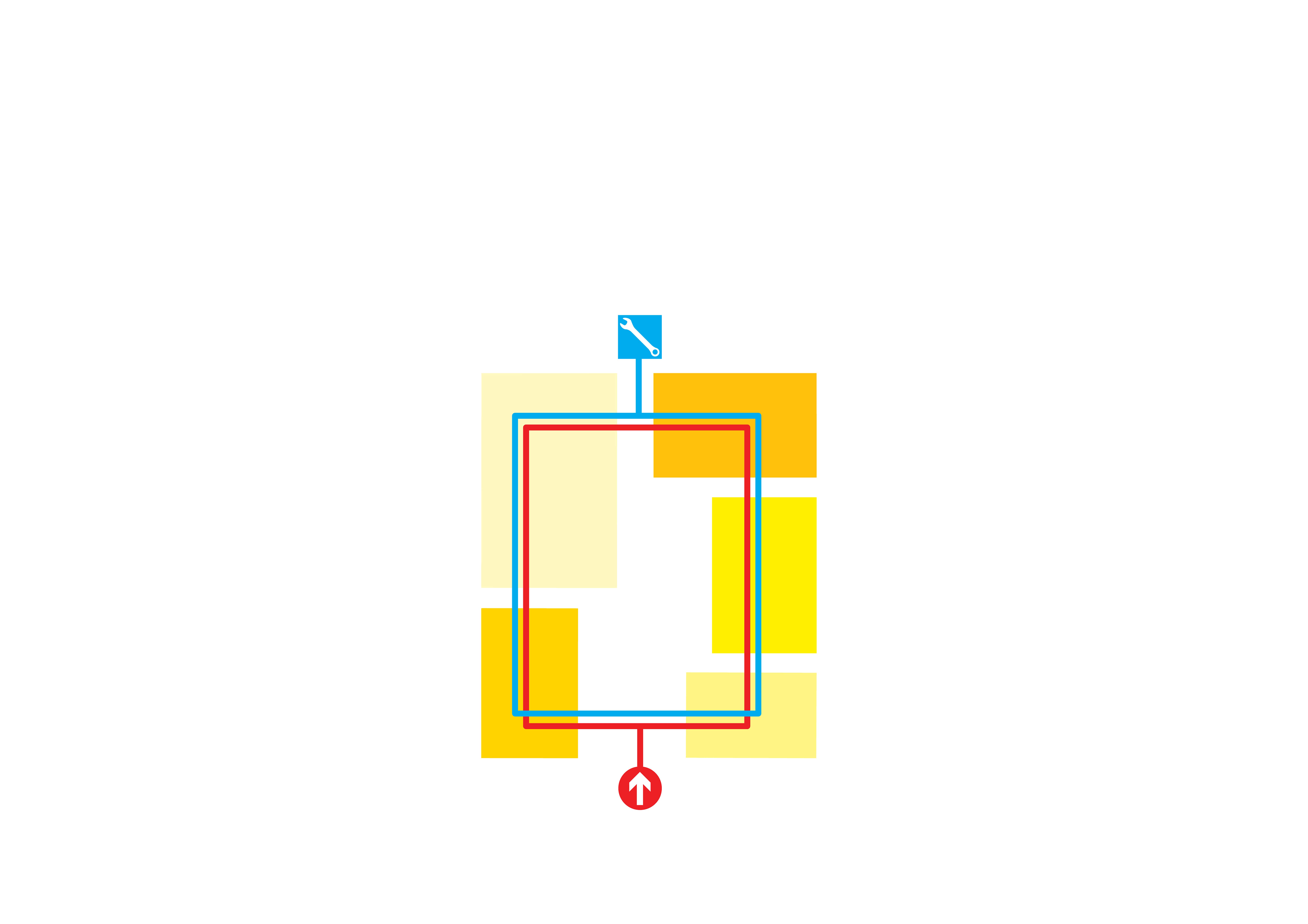
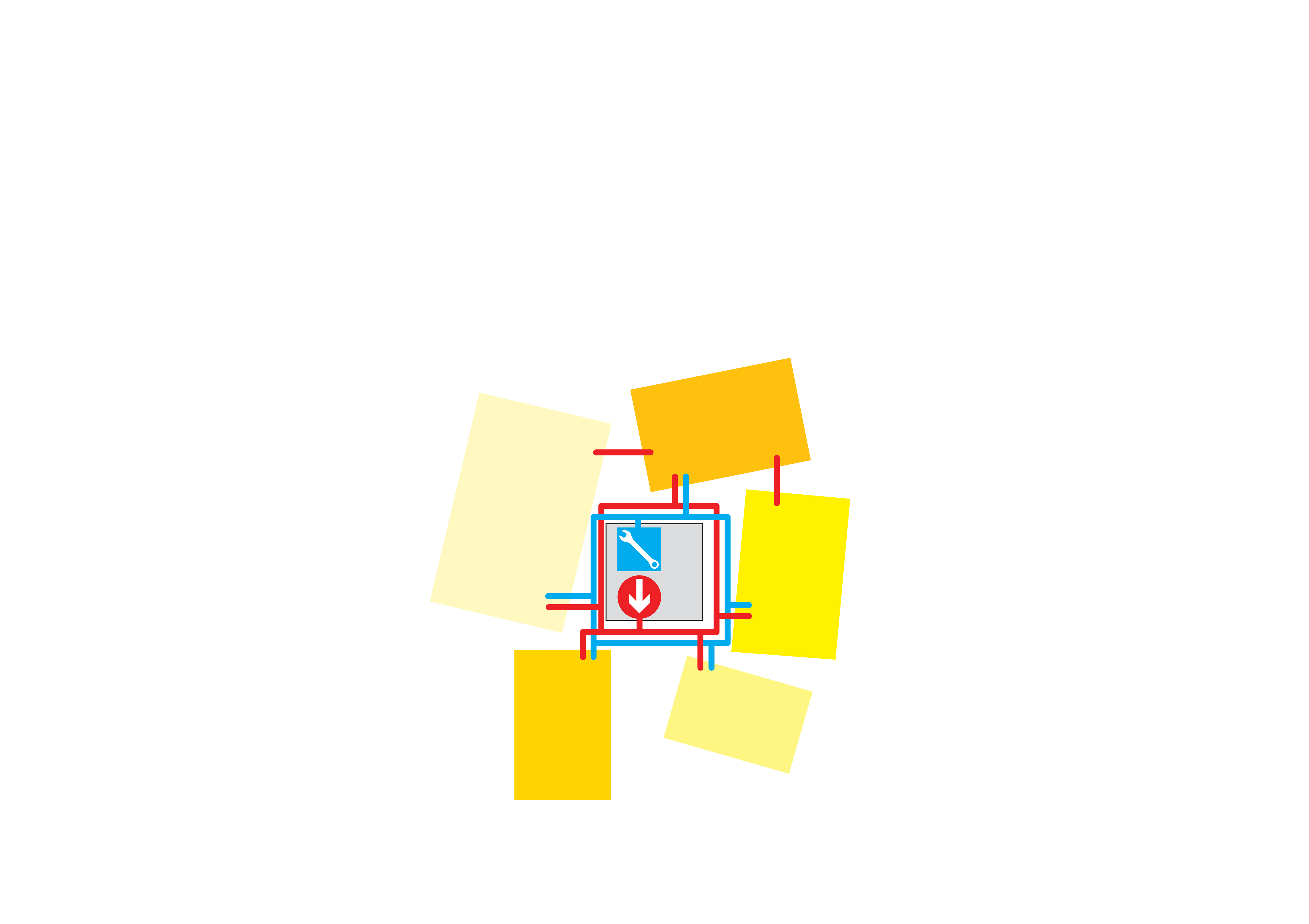
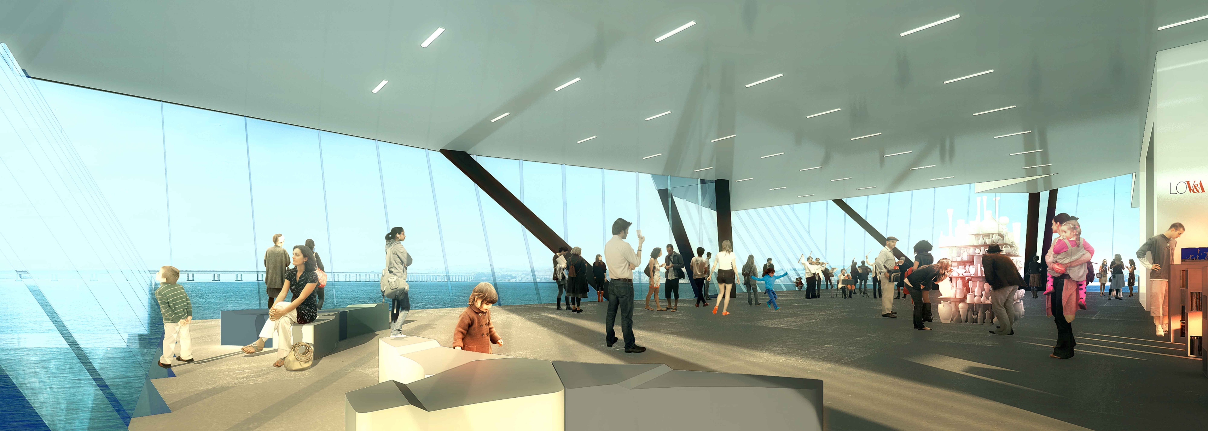
A centralized core—housing all lifts, toilets, mechanical/electrical/plumbing distribution, and fire stairs—and eight trusses serve as the building’s primary gravity and lateral support. The trusses—located on Level 2—compose a structural bridge that spans the Main Hall, providing a column-free panoramic space interrupted only by the central core, and creates a table top on which the gallery boxes can freely rest. The condensed core also increases circulation efficiency, places all program areas to the perimeter with direct access to daylight, serves as a stack for natural ventilation, and creates a Hub-and-Spoke organization on the Exhibition Layer, optimal for the flexibility of exhibition staging and visitor experience.
Shrink Wrap
Having maximized sustainability and flexibility by stretching the V&A at Dundee’s top, and having minimized sub-structure cost by contracting its base, the inverted pyramid is shrink-wrapped around the galleries to economize area and to create a secondary structural layer of efficient, diagonal perimeter columns.
Reflect the Surroundings
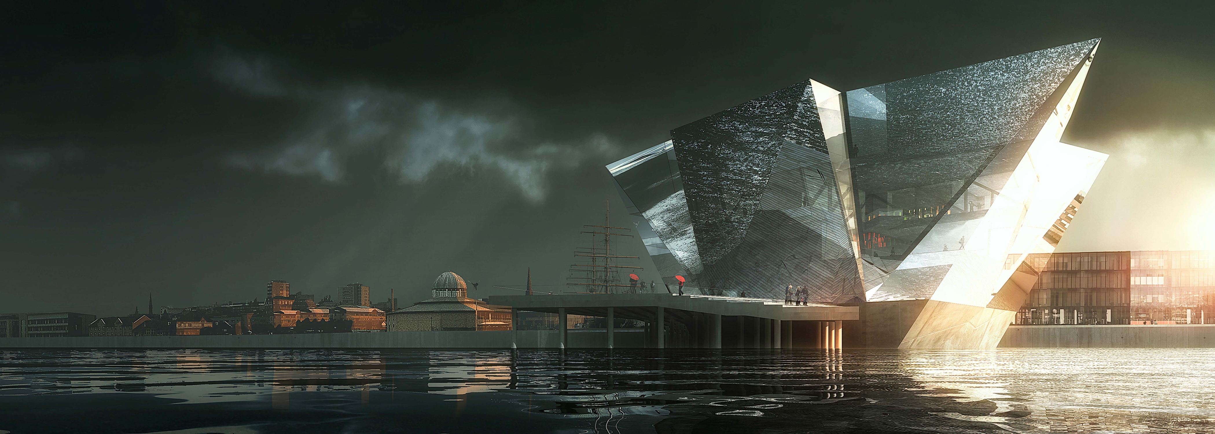
Clad in mirror glass, the V&A at Dundee reflects the River Tay, the sky, and the RRS Discovery, while further reducing thermal loads and interior glare. The angled facades prevent sunlight from blinding the building’s neighbors.
The conclusion is an unexpected and iconographic building concept that is the embodiment of high-performance and economy, not a symbol of excess.
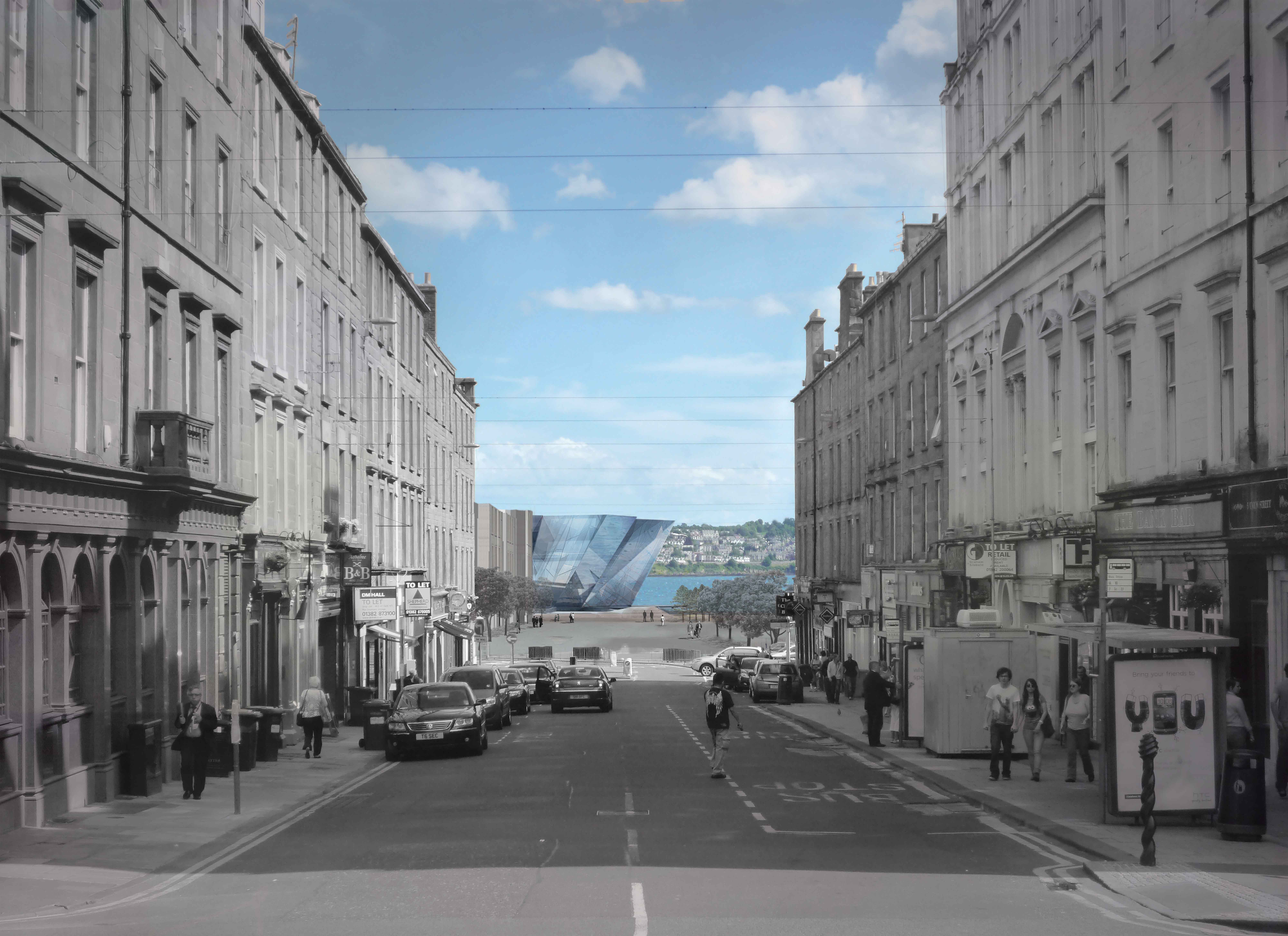
During the day, the mirrored facade shifts with the dynamic swings in weather, creating a jewel-like object at the end of the Union Street Axis, that reflects the River Tay an the RRS Discovery.
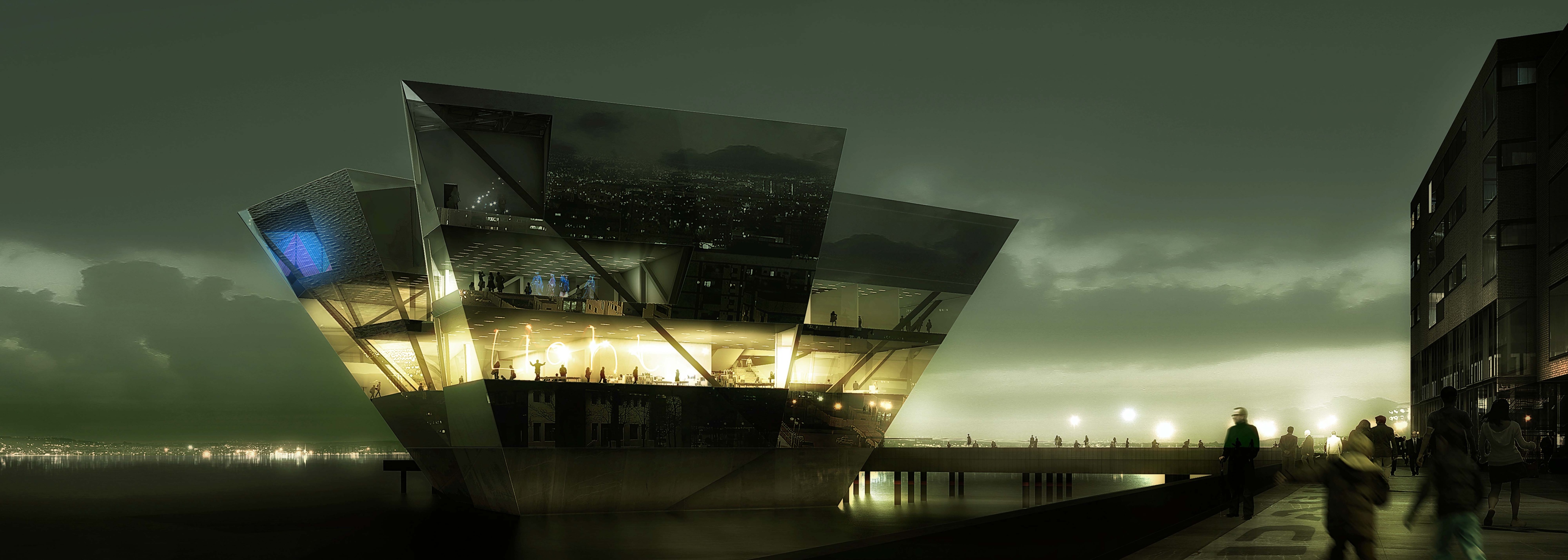
By night, the facade dematerializes like a jellyfish, revealing the Layer Cake organization within and contributing to an active evening scene on the new Dundee Waterfront.
Marshalling Layer (6.0 m AOD)
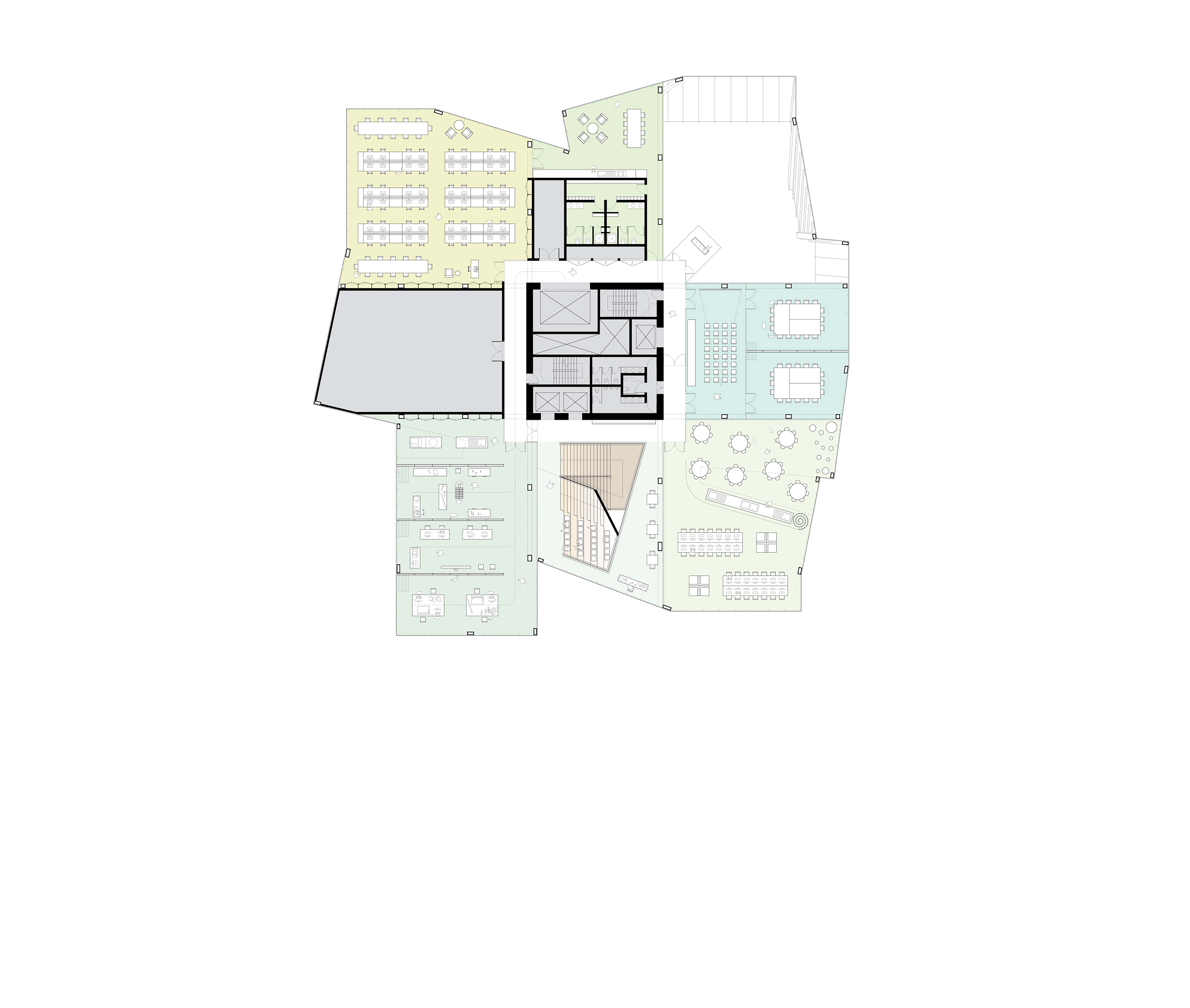
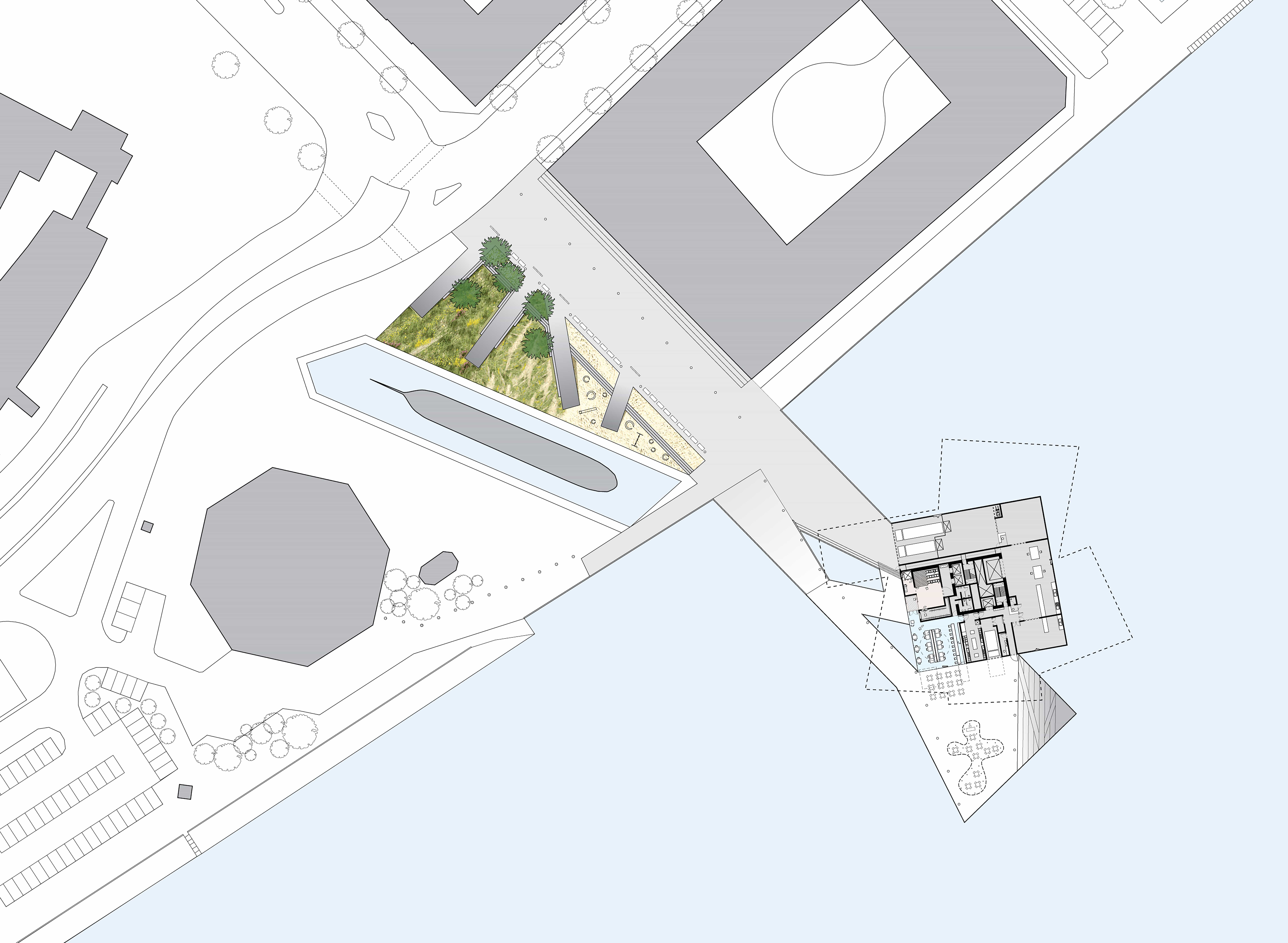
The Marshalling Layer is a super efficient, compact square that contains only those elements required at grade—loading docks, secure storage areas, public and staff entries, Signature Restaurant, and Wine Bar—and orchestrates the complex flows of patrons, staff, art, and deliveries without impacting the rest of the V&A at Dundee. By connecting the pier predominantly to public areas, the plaza is kept active and the impact of blank facades on pedestrian experience is minimized. Security is increased as well: the most highly controlled areas are surrounded by water with accessibility limited to two points.
Civic Layer (11.0 m AOD)
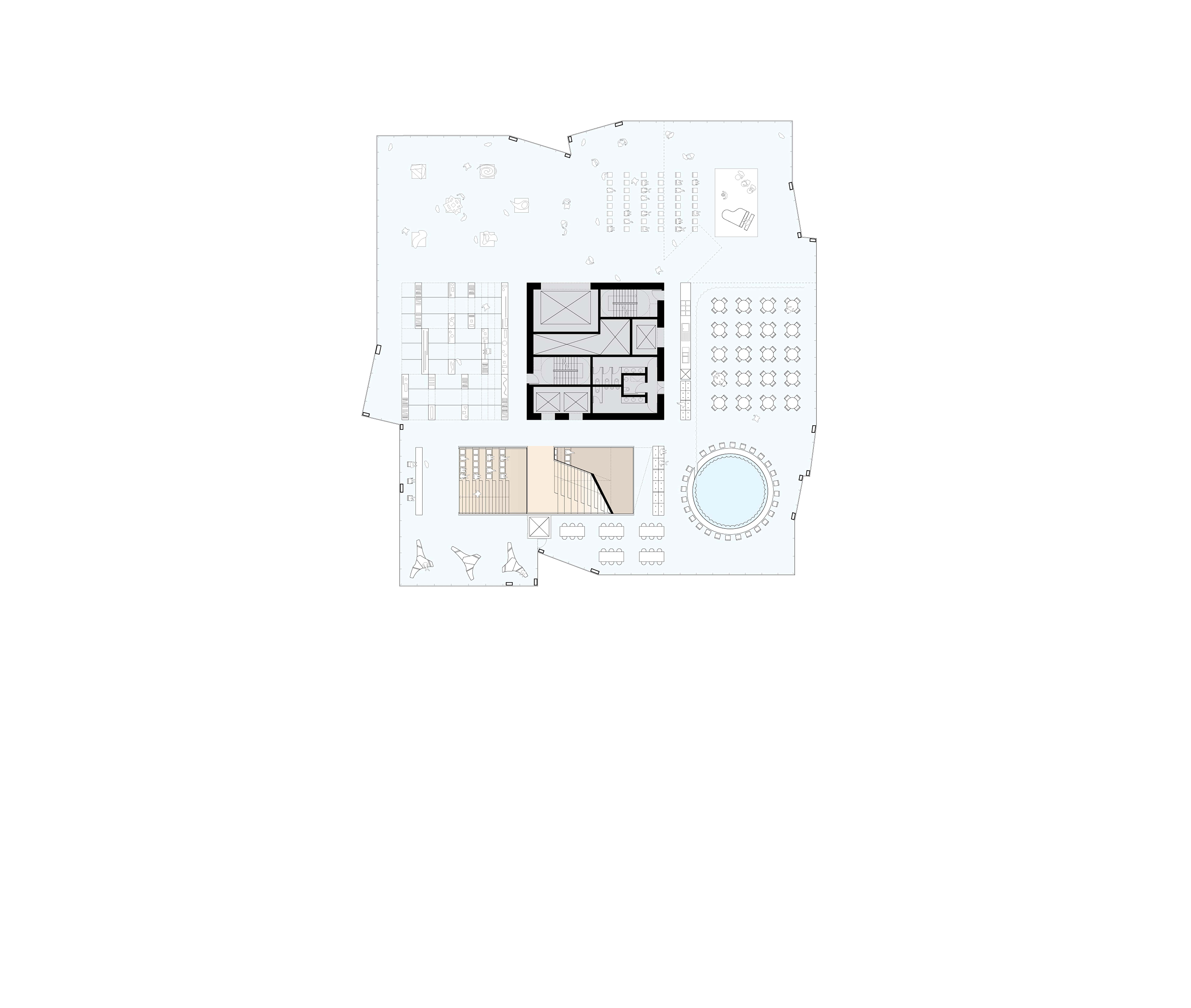
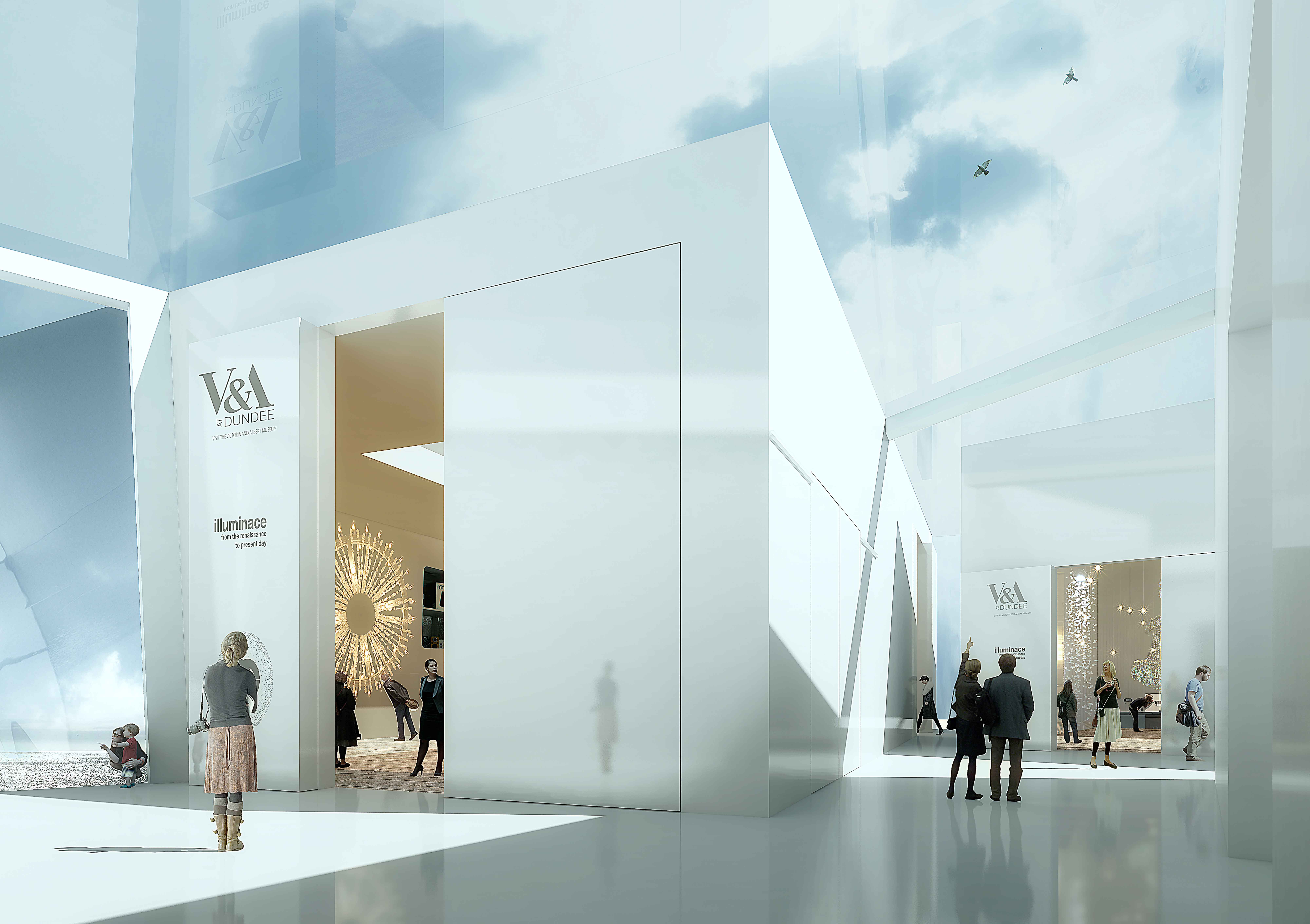
The Civic Layer is a blank slate on which the City of Dundee can inscribe its visions, an interiorized public realm elevated just high enough to place the City and River Tay in relief, and low enough to remain directly connected to the public plaza through a dramatic entry and orientation space. Although highly flexible, the Civic Layer—paved with local Scottish stone—is of sufficient quality that its elegant character is retained regardless of its use.
Creative Layer (17.0 m AOD)
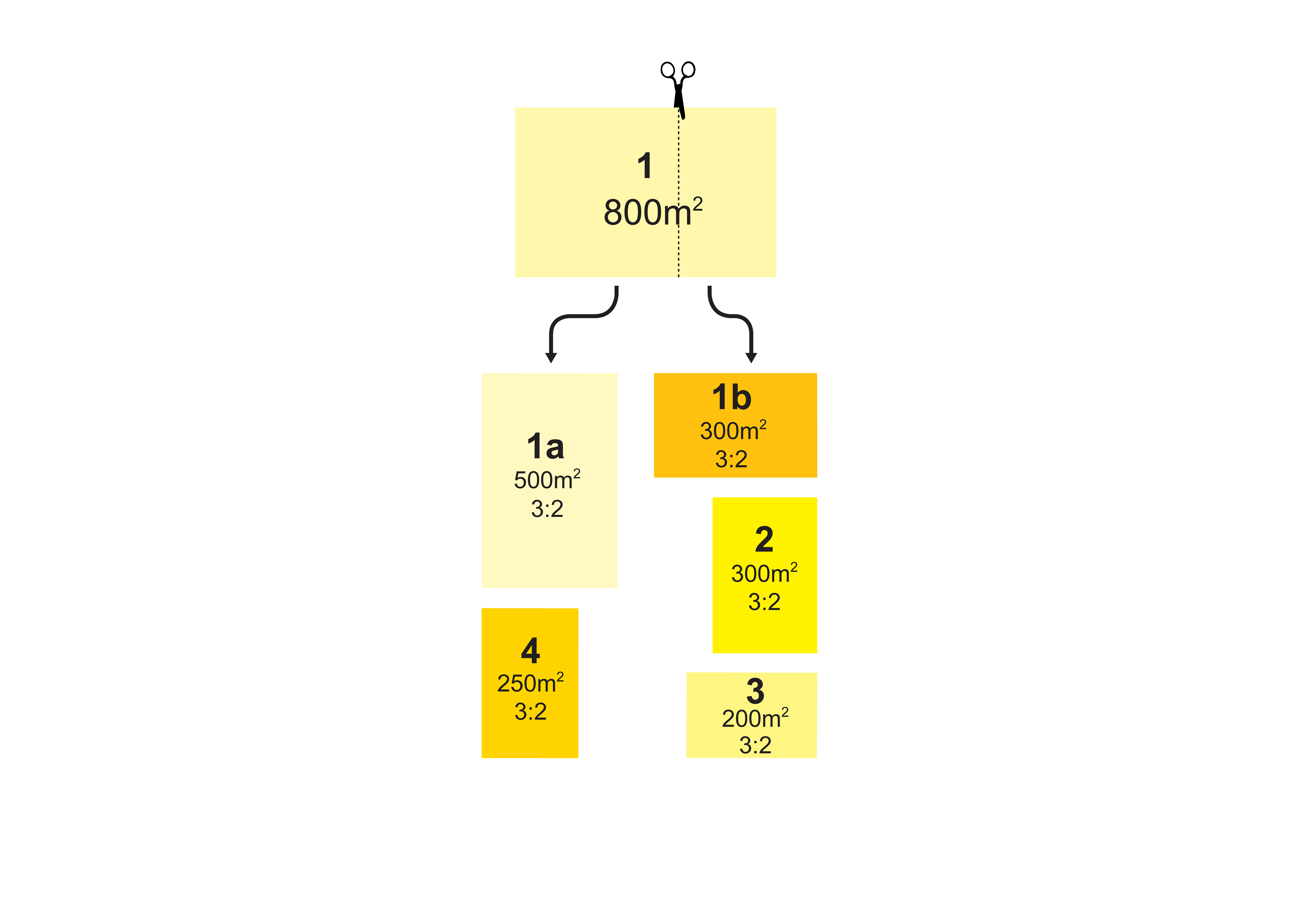
The Creative Layer, comprised of the Design In Action programs and center’s staff facilities, is configured as an eight square ring with spaces delimited by the eight trusses. Organized around a circulation raceway, the subdivisions can readily be converted from public and private or day and evening access. Four Design In Action spaces—the Practitioners Zone, a Public Observation Zone, the Education Zone, and the Knowledge Exchange Zone—and two staff areas—Offices and Staff Accommodation—can easily be repurposed as the V&A at Dundee’s needs are refined. Additionally, a seventh adjacent compartment—currently the “Pulpit”—provides the potential to add 250 m² of programmable area.
Exhibition Layer (22.0 m AOD)
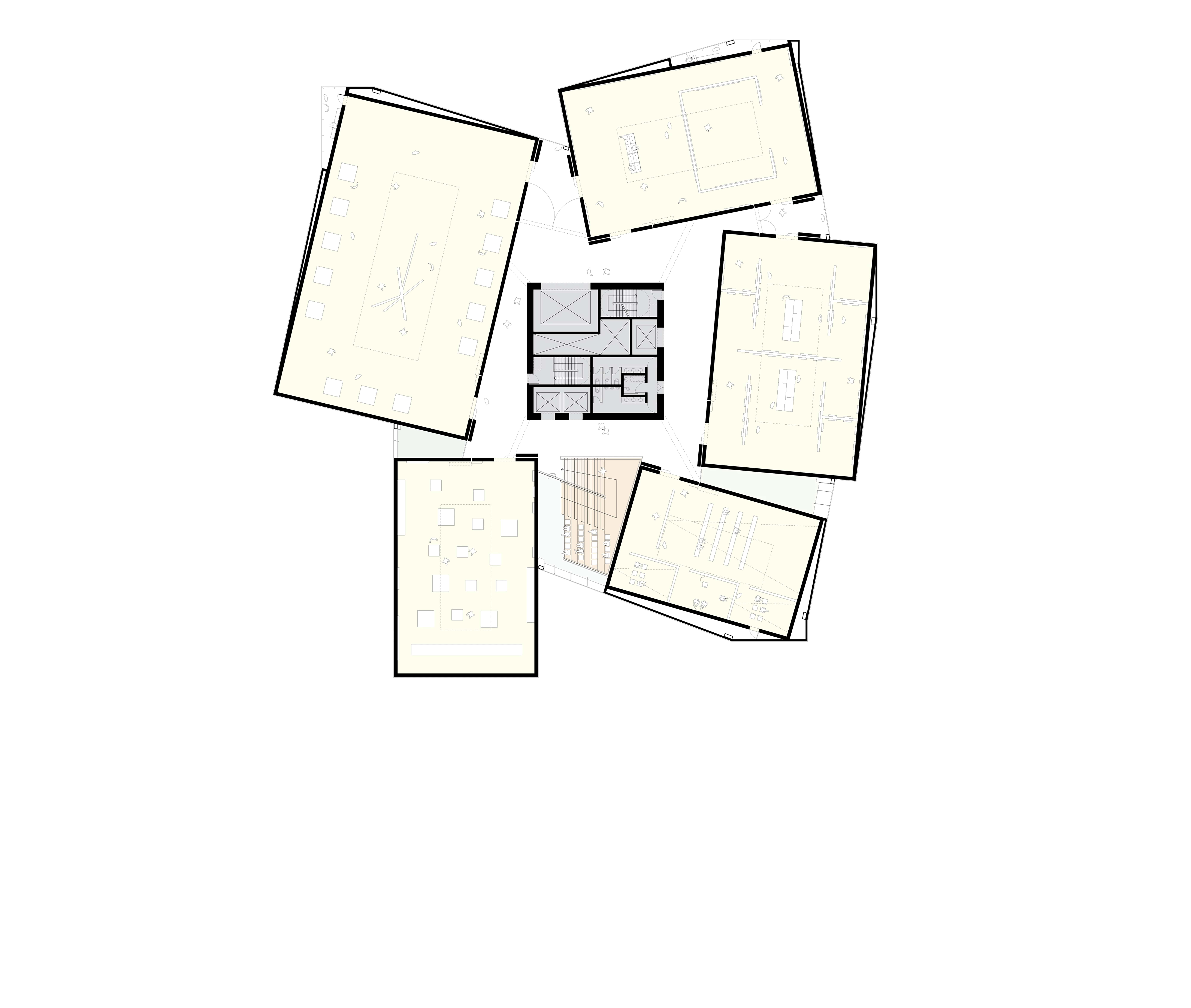
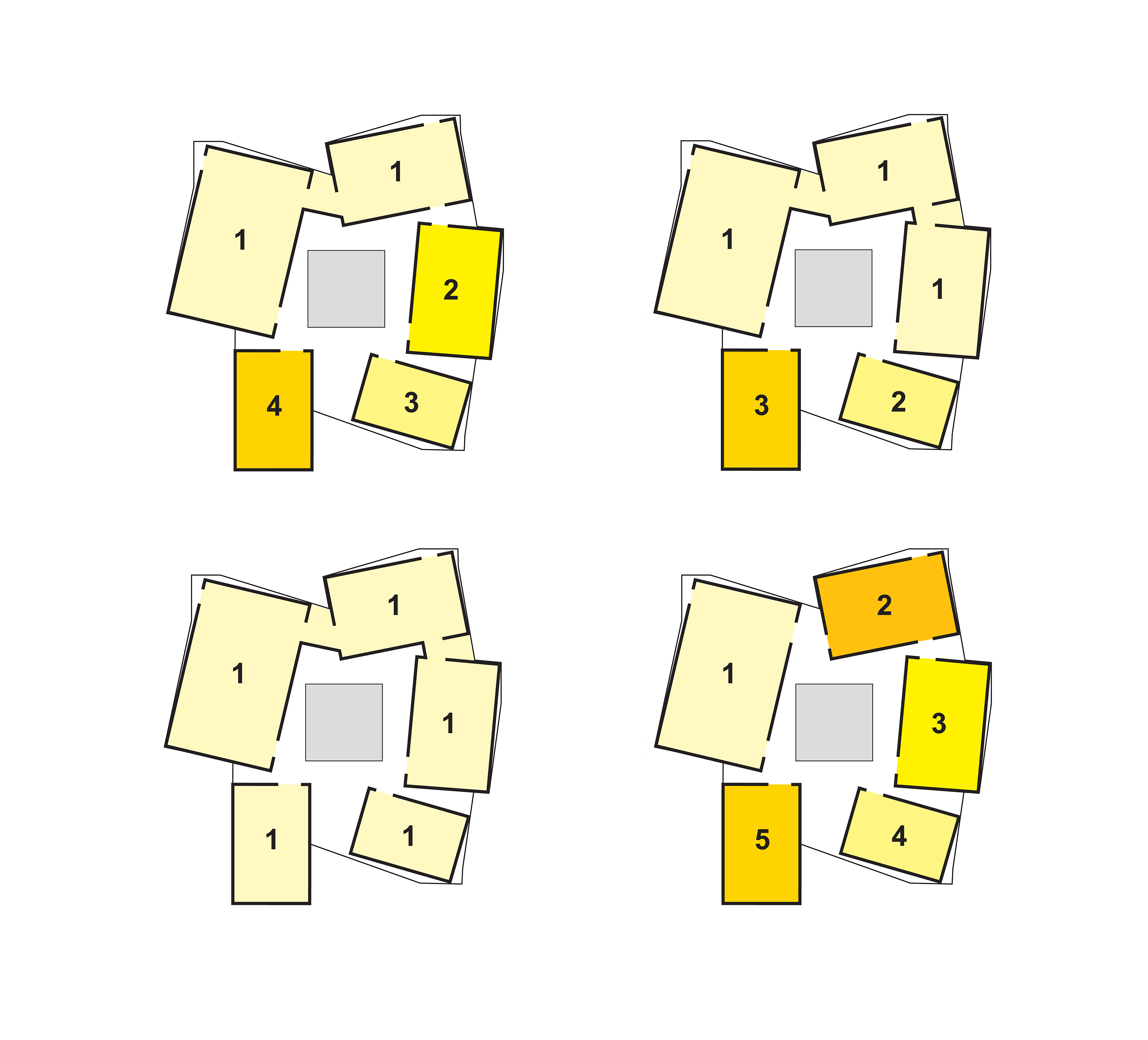
The Exhibition Layer is the most determined of the V&A at Dundee’s components. Housing all five galleries in idealized proportions (a 3:2 length to width ratio) around a centralized core, the Exhibition Layer’s Hub-and-Spoke organization provides independent access to each gallery, or a procession through any plausible combination of galleries. Further, centrally locating the art lift and art circulation allows shows to be mounted or dismounted individually with minimal impact on any other gallery. Placing the “main attraction” at the building’s top draws patrons through the Main Hall, Brasserie, Retail, and Design In Action facilities, high into the V&A at Dundee.
The V&A at Dundee’s galleries are:
1. Organized on one floor to ensure the patrons’ continuity of experience.
2. Placed at the top of the building to allow a skylight system for each gallery.
3. Sized to the requirements of the brief, including Gallery 1, which is subdivided into 500 m² and 300 m² components (as 95% of all shows can fit within a 500 m² gallery).
4. Proportioned in an ideal 3:2 plan ratio.
5. 6 m clear in height.
The conventional museum procession is a lobby that begins and concludes a linear loop of galleries. This compulsory circulation causes major curatorial and operational problems for its institutions. They must use all their galleries at once and cannot easily subdivide space for simultaneous shows, and the entire loop must be closed during the mounting and dismounting of a show in any gallery. Institutions with this sequence have to continuously “feed the beast,” exhibiting blockbuster after blockbuster after blockbuster, and must support staffs capable of managing shows this size. The linear circulation also sets a prescribed sequence which visitors must repeatedly follow.
Placing patron and art circulation at the galleries’ center creates a Hub-and-Spoke organization. Rather than imposing a fixed sequence on curators or patrons, the Hub-and-Spoke provides a procession through any plausible combination of galleries as well as independent access to each gallery. Further, locating the art lift and art circulation in the center of the galleries allows shows to be mounted or dismounted individually with minimal impact on any other gallery/show.
In addition to the four and three show configurations required by the V&A at Dundee’s brief, the Hub-and-Spoke organization enables the Exhibition Layer to also stage one large show or up to five shows simultaneously.
In the spirit of the Louisiana Museum of Modern Art in Humlebæk, Denmark, fissures in the Hub-and-Spoke organization provide moments of repose with views to the River Tay and City of Dundee, as well as spaces adjacent to the galleries for the display of less sensitive works, educational gatherings, or movable retail points.
In the spirit of the Louisiana Museum of Modern Art in Humlebæk, Denmark, fissures in the Hub-and-Spoke organization provide moments of repose with views to the River Tay and City of Dundee, as well as spaces adjacent to the galleries for the display of less sensitive works, educational gatherings, or movable retail points.
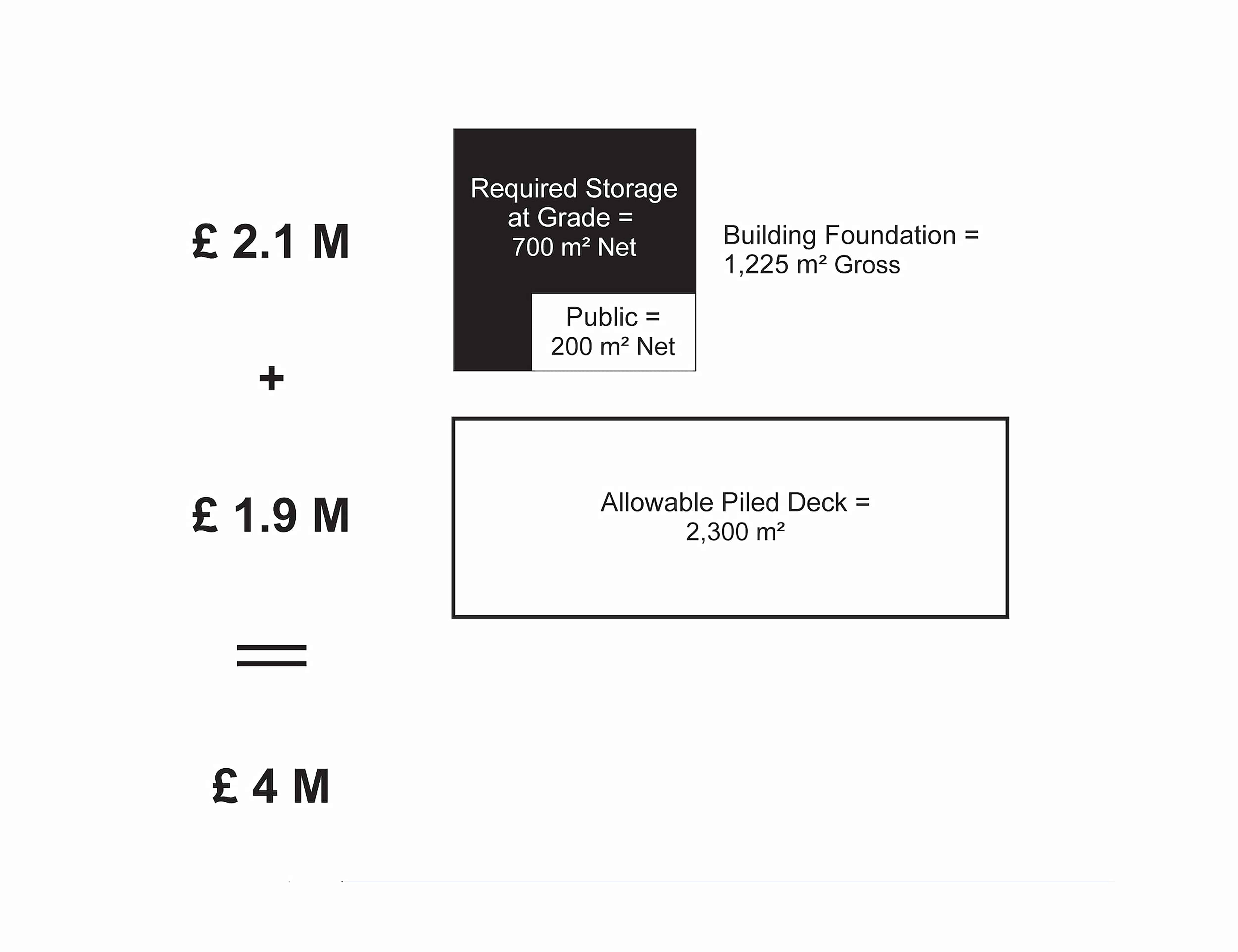
The V&A at Dundee’s Design and Performance Specification identifies 700 m² of net Exhibition Storage on one level, preferably at grade with direct pier access. Accommodations for public and private building entry, Signature Restaurant, and Wine Bar—for a total net area of 200 m²—should also reasonably be located at grade. This minimum building footprint totals 1,225 m² of gross area, with a building foundation cost of £2.1 M. Aiming to create the largest amenity for the City using the remaining £1.9 M of the £4 M Site Creation budget, a Piled Deck—the most cost effective solution—can be sized to 2,300 m².
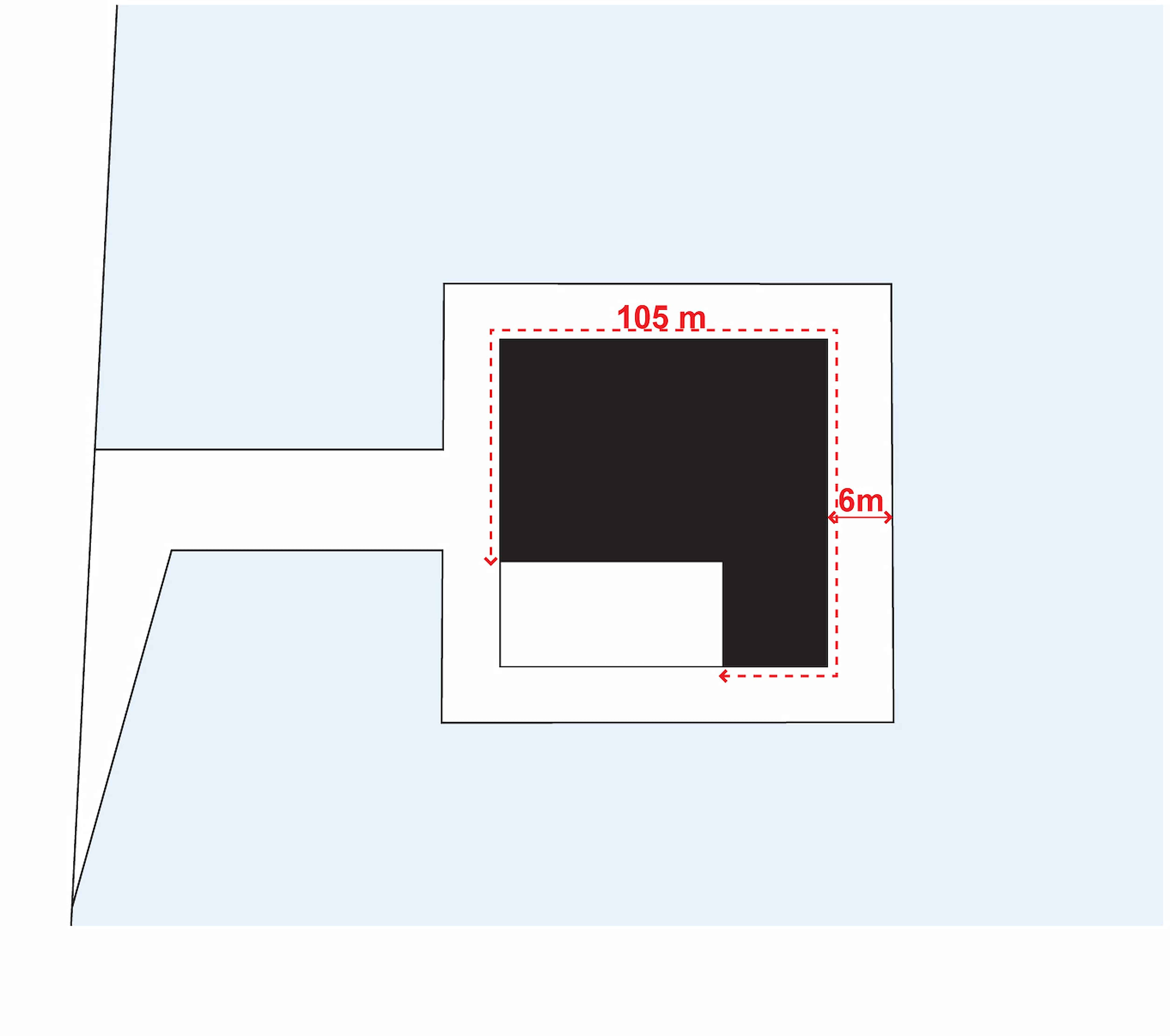
Shaping the Piled Deck to accommodate truck access and a 6 m wide pedestrian pathway around the building results in a poor quality public open space. The promenade is bordered by 105 linear meters of blank wall and is so attenuated that usable exterior spaces are not achievable. Further, the promenade would have to widen significantly to provide necessary fire truck access to at least half the V&A at Dundee’s perimeter.
When the Piled Deck is condensed into a linear pier extending the Union Street Axis beyond the V&A at Dundee, credible public space is created that can accommodate activities and installations such as temporary summer structures, blank walls are reduced to only 24 linear meters (77% less), fire truck access is provided, and uninterrupted views of Dundee are offered.
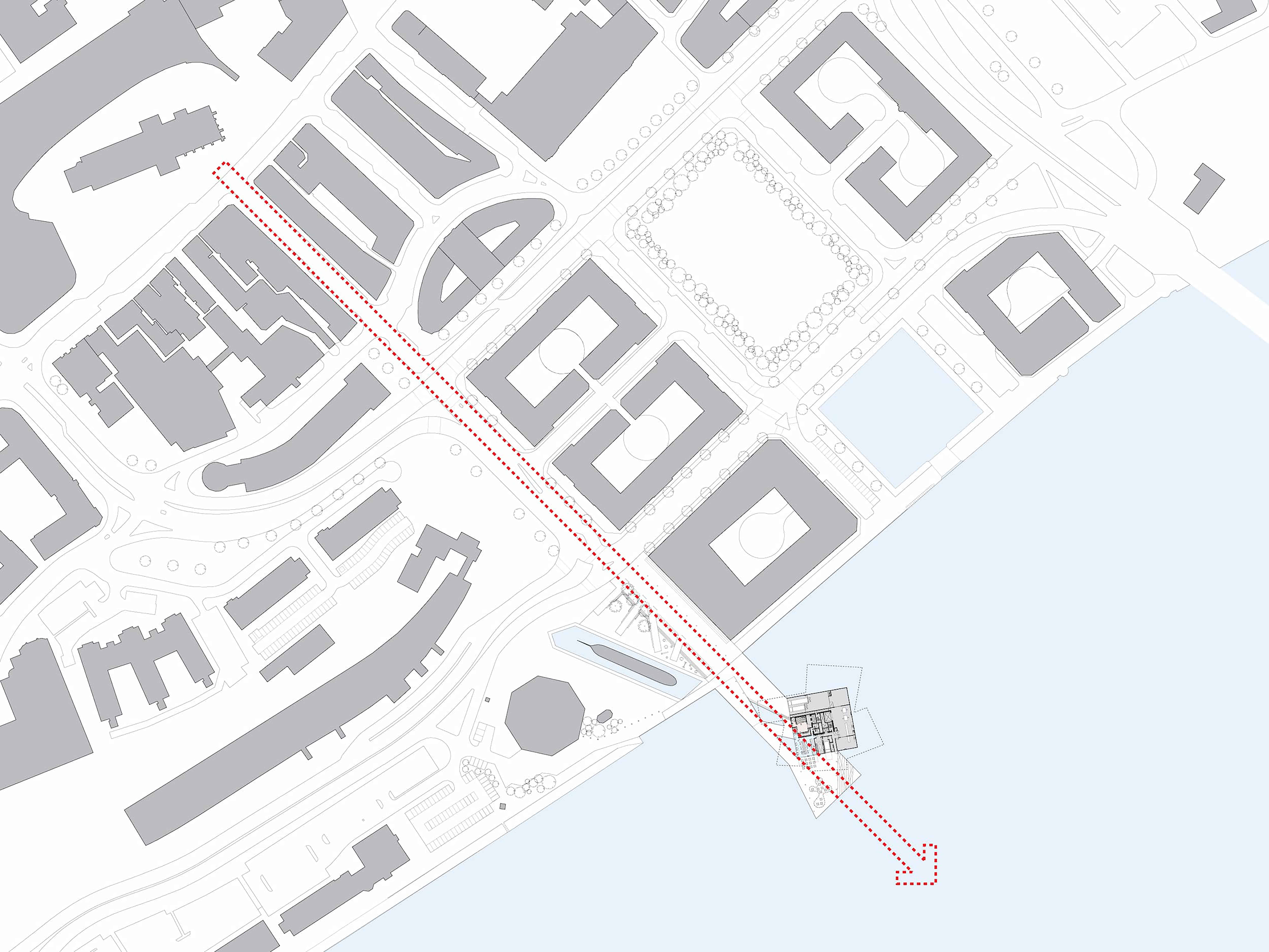
The V&A at Dundee’s site design concept provides a strong, simple pier that extends the axis of Union Street and connects the V&A at Dundee with the urban fabric physically and visually.
The siting of the V&A at Dundee just off Union Street’s center axis maintains the street and new plaza extension as a completely public thoroughfare, tangent only to the building’s public and delivery entries. The building’s sloped geometry broadcasts its presence and yet maintains clear views to the Tay and of the RRS Discovery.
The pier is inspired by the marine context of the River Tay and provides an open, flexible public space. By filling Craig Harbour and encouraging a dune landscape to form around the pier, the V&A at Dundee extends to the streetscape. This dune landscape is a living exhibit of native plant and wildlife communities. Visitors will experience the landscape transition from grasses, gorge, heather, and pine to sand and beach as they approach and leave the V&A at Dundee. Additionally, a series of seat-wall lined ‘fingers’ extend towards the RRS Discovery, defining informal gathering spaces. The pier itself will be constructed of ekki decking timbers—a very strong, durable, and high density wood that can easily withstand truck deliveries, emergency vehicle access, and storm water.
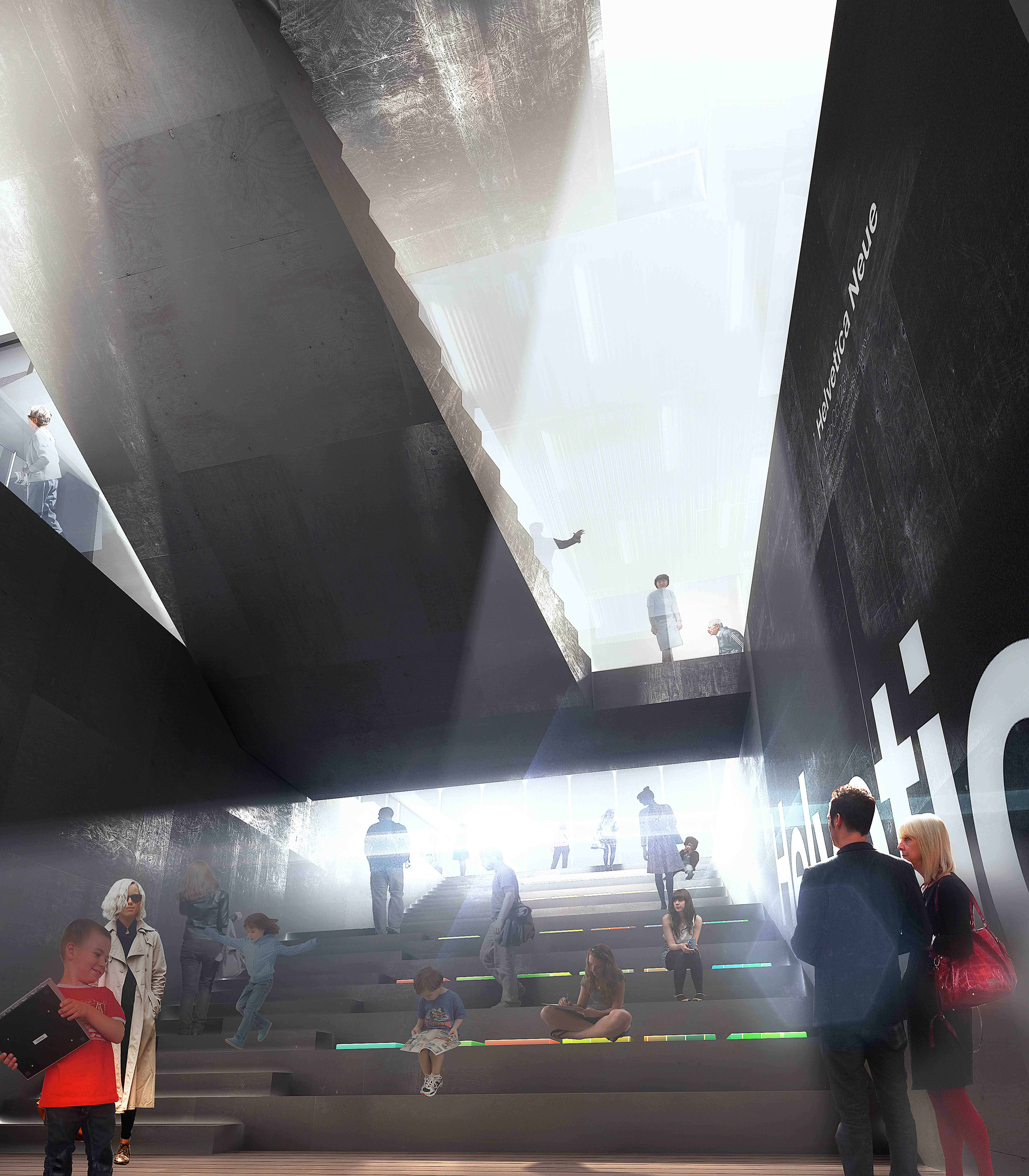
The V&A at Dundee’s Grand Staircase is a continuation of the exterior plaza, taking patrons on a journey through design, from initial concepts to points of sale.
As the Grand Staircase slices through the V&A at Dundee, publicly connecting each of its discrete layers, it integrates tribune seating in the entry to provide a view of the Digital Wall and a meeting point for groups, and in the Creative Layer it provides a Public Observation Zone from which to watch the V&A at Dundee’s practitioners-in-residence.
The V&A at Dundee’s Grand Staircase directly links the Civic Layer to Dundee’s urban fabric, allowing the Main Hall and Event Space to be a blank slate on which the City of Dundee can inscribe its visions.
For the last hundred years, form and function have been pitted in a superficial and unproductive struggle. Emphasizing performance instead—a hybrid that doesn’t discriminate between program, organization, and form—silences the debate over whether architecture is an art or a tool. The V&A at Dundee’s measure of high performance is relative to its specific constraints, requirements, and aspirations. By eschewing convention and doggedly searching for responses specific to these particular demands, an unexpected and iconographic building emerges that is the embodiment of performance, not a symbol of excess.
Image credits: 1, 10, 11, 21, 30: Luxigon; 2, 32: Radii
